Quick Jumps
Layout
Text
Image Helper Classes
Quick floats
Float an element to the left or right with a class. !important is included to avoid specificity issues. Classes can also be used as mixins.
<div class="pull-left">...</div>
<div class="pull-right">...</div>
<div class="float-left">...</div>
<div class="float-right">...</div>
 Example of .float-left and .float-right. The main difference between the float and the pull is that margin is added to the float class so the text does not run into the images. Duis aliquet egestas purus in blandit. Curabitur vulputate, ligula lacinia scelerisque tempor, lacus lacus ornareante, ac egestas est urna sit amet arcu. Class aptent taciti sociosqu ad litora torquent per conubia nostra, per inceptos himenaeos. Sedmolestie augue sit amet leo consequat posuere. Vestibulum ante ipsum primis in faucibus orci luctus et ultrices posuere cubilia Curae; Proin vel ante a orci tempus eleifend ut et magna. Lorem ipsum dolor sit.
Center content blocks
Set an element to display: block and center via margin.
<div class="center-block">...</div>
Make button and blocks full width
Set an element to display: block and with 100% min-with and width.
-Added Base 7 Ver 1.0.9
<div class="full-width">...</div>
Clearfix
Easily clear floats by adding .clearfix to the parent element. Utilizes the micro clearfix as popularized by Nicolas Gallagher.
<!-- Usage as a class -->
<div class="clearfix">...</div>
Showing and hiding content
Force an element to be shown or hidden (including for screen readers) with the use of .show and .hidden classes. These classes use !important to avoid specificity conflicts, just like the quick floats. They are only available for block level toggling.
Furthermore, .invisible can be used to toggle only the visibility of an element, meaning its display is not modified and the element can still affect the flow of the document.
<div class="show">...</div>
<div class="hidden">...</div>
<div class="invisible">...</div>
Spacer Helpers
Spacer Helpers are designed to allow for quick overrides to the spacing between HTML objects. Spacer Helpers work by resetting the margin space on an object. Above and below helper can be used together.
- spacer-above-none
- spacer-above-5
- spacer-above-10
- spacer-above-20
- spacer-above-30
- spacer-below-none
- spacer-below-10
- spacer-below-20
- spacer-below-30
<div class="spacer-above-5 spacer-below-none">...</div>
Rule
Article Rule
.light-rule can be added to for the effect below
.lower-rule is a class that can be added to a pane or as panalizer css class, it adds a lower border to the body of a page
Numbered Rules
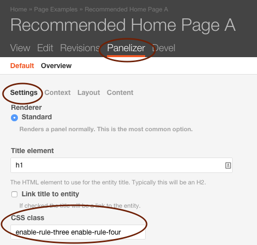
All home page and overview page layouts have numbered rule divs <div class="rule-one rule"></div> below every row of multi-column rows. Selector classes are numbered from rule-one to rule-eight. These classes can be targeted directly with CSS or use the helper classes enable each one. Helper classes can be added to the Panalizer setting screen.
<div class="enable-rule-one enable-rule-three">
<div class="rule-one rule"></div>
<div class="rule-two rule"></div>
<div class="rule-three rule"></div>
</div>
.enable-rule-one .rule-one,
.enable-rule-two .rule-two,
.enable-rule-three .rule-three,
.enable-rule-four .rule-four,
.enable-rule-five .rule-five,
.enable-rule-six .rule-six,
.enable-rule-seven .rule-seven,
.enable-rule-eight .rule-eight
Transformation classes
Transform text in components with text capitalization classes.
lowercased text.
UPPERCASED TEXT.
Capitalized Text.
Force text to nowrap
<p class="text-lowercase">Lowercased text.</p>
<p class="text-uppercase">Uppercased text.</p>
<p class="text-capitalize">Capitalized text.</p>
<p class="text-nowrap">Use the force to make text not wrap.</p>
<p class="text-left">Use the force to make text float left.</p>
<p class="text-right">Use the force to make text float right.</p>
<p class="text-center">Use the force to make text float center.</p>
Drop cap
The .dropcap class can be applied to any block of text. To apply to a section, .dropcap can been added to a block or pane.
<div class="dropcap">
<p>Praesent id metus massa, ut blandit odio. Proin quis tortor orci. Etiam at risus et justo dignissim congue. Donec congue lacinia dui, a porttitor lectus condimentum laoreet. Nunc eu ullamcorper orci. Quisque eget odio ac lectus vestibulum faucibus eget in metus. In pellentesque faucibus vestibulum. Nulla at nulla justo, eget luctus tortor. Nulla facilisi. Duis aliquet egestas.</p>
<p>Duis aliquet egestas purus in blandit. Curabitur vulputate, ligula lacinia.Praesent id metus massa, ut blandit odio. Proin quis tortor orci. Etiam at risus et justo dignissim congue. Donec congue lacinia dui, a porttitor lectus condimentum laoreet. Nunc eu ullamcorper orci. Quisque eget odio ac lectus vestibulum faucibus eget in metus. In pellentesque faucibus vestibulum. Nulla at nulla justo, eget luctus tortor. Nulla facilisi. Duis aliquet egestas.</p>
</div>
Praesent id metus massa, ut blandit odio. Proin quis tortor orci. Etiam at risus et justo dignissim congue. Donec congue lacinia dui, a porttitor lectus condimentum laoreet. Nunc eu ullamcorper orci. Quisque eget odio ac lectus vestibulum faucibus eget in metus. In pellentesque faucibus vestibulum. Nulla at nulla justo, eget luctus tortor. Nulla facilisi. Duis aliquet egestas.
Duis aliquet egestas purus in blandit. Curabitur vulputate, ligula lacinia.Praesent id metus massa, ut blandit odio. Proin quis tortor orci. Etiam at risus et justo dignissim congue. Donec congue lacinia dui, a porttitor lectus condimentum laoreet. Nunc eu ullamcorper orci. Quisque eget odio ac lectus vestibulum faucibus eget in metus. In pellentesque faucibus vestibulum. Nulla at nulla justo, eget luctus tortor. Nulla facilisi. Duis aliquet egestas.
Featured Set Title
If you need a title similar to the heading above (also the same within metroid, pacman and contra) you may use class="featured-set-title"
Alternate H3 Colors
By special request alternate H3 classes have been added to the styleguide. This system allows for the adding of helper color classes to any h3. Note: Make sure this tweak "config.extraAllowedContent = 'h3(light-bright-blue,medium-blue,light-gray,outline-gray,gold,orange,bright-blue,navy,cool-gray)'; " is added to the ckeditor settings.(/admin/config/content/ckeditor/edit/Full) Also discussion about this topic http://drupal.stackexchange.com/questions/90710/prevent-wysiwygckeditor-from-stripping-html-classes
Normal H3
<h3 class="missional-blue-shade">H3 .missional-blue-shade</h3>
<h3 class="hopeful-blue-shade">H3 .hopeful-blue-shade</h3>
<h3 class="revival-orange-165">H3 .revival-orange-165</h3>
<h3 class="fiya-gold-shade">H3 .fiya-gold-shade</h3>
<h3 class="outline-gray">H3 .outline-gray</h3>
<h3 class="text-gray">H3 .text-gray</h3>
<h3 class="light-gray">H3 .light-gray</h3>
<h3 class="missional-blue-315">H3 .missional-blue-315</h3>
<h3 class="hopeful-blue-637">H3 .hopeful-blue-637</h3>
<h3 class="missional-blue-tint">H3 .missional-blue-tint</h3>
H3 .missional-blue-shade (Missional Blue Shade)
H3 .hopeful-blue-shade (Hopeful Blue Shade)
H3 .revival-orange-165 (Revival Orange 165)
H3 .fiya-gold-shade (Fiva Gold Shade)
H3 .outline-gray (Outline Gray)
H3 .text-gray (Text Gray)
H3 .light-gray (Light Gray)
H3 .missional-blue-315 (Missional Blue 315)
H3 .hopeful-blue-637 (Hopeful Blue 637)
H3 .missional-blue-tint (Missional Blue Tint)
Polaroid
The .polaroid class will wrap the image or HTML object in a micro pseudo polaroid border.
<img alt="" class="polaroid" src="/sites/styleguide/files/1581_1.jpg" />
No Polaroid (as of v1.0.16)
Some images automatically have the polaroid effect, in order to turn it off, you may add .no-polaroid to the item with the image class. For example, look at the views page under DonkeyKong, the <div class="image"> and instead make it class="image no-polaroid" and you will see the polaroid effect go away, See:

Caption
We have a .caption class definded. A JS soultion might be a better option.
<div class="caption">

This is the .caption class
Info Banner Classes
Website like LAT and Student Soul that have the legacy banner size of 232px tall can use the helper class .header-info232 to sise the rotator the info block to the 232 px height.
Other websites that have use a 349px banner can use the .header-info350 class to size rotator and info block.
